
If you want a mobile-friendly website – what does this mean and how do you go about it?
A mobile-friendly website is one that is easy to use on a smart-phone or tablet. Easy for many people means not having to struggle with tiny text. Pinching and resizing text, and trying to use navigation designed to be read on a PC sized screen is not fun.
But it can mean so much more than that.
First - why would you want to have a mobile friendly website?
The use of mobile devices – smart-phones and tablets - is growing. Smart-phone use in New Zealand is at 44% of households and not showing any sign of slowing. As more people access the web when and from where they want to using iPads, mini tablets and smart-phones, the need to accommodate them will become more pressing.
People will demand an optimal experience regardless of how they are accessing your business information and services. They want it made easy to find your contact information, book an event, buy a ticket or product. If not they'll go somewhere else.
The challenge of using a smart-phone to access information on a website that is not mobile friendly came home to me when I had to access the Civil Defense website from a west coast beach on my phone with it's tiny 3.2 inch screen. If it had been a real emergency, the website would have been no help whatsoever as I struggled to read and navigate through waaayyy too much information. All I wanted to know was whether that was a real tsunami warning, or just a drill. (Fortunately, it was just a drill!)
So there are two main ways to go if you want your site to be mobile friendly. Each has their pros and cons:
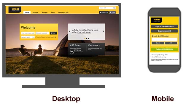
1. A dedicated mobile website.
This is a separate version of your website that visitors are redirected to if they access your site via a mobile device. The site is specifically designed for small screens so it minimises the amount of content in a clean, uncluttered manner. And it is very focused on providing you a way to do the things you would typically want to do via a mobile. If relevant, it will help you along by using GPS location information.
Pros
- Built for smaller screens and touch screen devices so generally easier to use
- Easy and quicker to develop
- Can focus on the specific needs of a user in the mobile context
- Can build a mobile site without redesigning your existing desktop site
Cons
- There is no standard screen size for mobile devices so may still not deliver an optimum experience (a minor point)
- Maintenance costs can be higher because you have two websites with dedicated content to look after
- SEO efforts have to be increased to capture for having two sites
- Two sources of visitor analytics data need to be consolidated
- Reportedly, problems with device detection can led mobile users to the full site and visa-versa
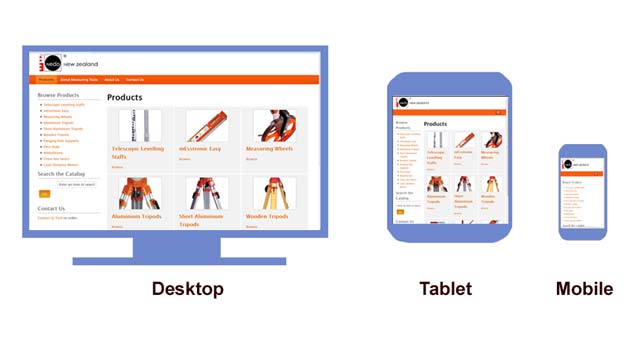
2. Responsive design
Responsive design means the layout of a web page based is on the size of the users viewing area that the site detects. So it's the same or similar content, but organised differently.
When building a responsive site you have to test every page at the different device resolutions and make decisions about each piece of content and whether it's relevant and usable for that context.
It's not about going minimal and limiting the text on your pages. Content is essential for SEO, establishing thought leadership, providing add-value information, reducing customer enquiries etc.
Pros
- Single source of content makes it much easier to maintain
- All content can be made available to a user if they want it. So the experience they have is similar regardless of which one of their devices they are using at the time.
- Design is flexible to respond to a range of screen sizes including laptops and TV browsers
- All content can be leveraged for SEO purposes – a single URL for all pages makes it easier to share and link back to .
Cons
- The need to consider all device configurations can actually led to a poorer user experience as compromises are made to fit all scenarios.
- The code overhead (the whole site is downloaded regardless) can cause problems on a device with a slow mobile internet connection, particularly with complex functionality and/or long pages and large file sizes
- It is more expensive as the whole process is more complex. There is more decision making and testing required. Purchasing a template that is already responsive and working within it's structure can save time/money and the top template developers for systems like Joomla! and Wordpress are offering very nice responsive designs.
- A longer more complicated design process can leave business owners struggling. Liquid layouts were all the rage a few years back until developers realised how difficult they were in the real world of client provided content.
Responsive design is a great choice when the only defining factor is the users device – in other words both desktop and mobile device users are trying to do the same thing and want the same content.
A separate mobile site will enable a more focused solution and acknowledges that mobile is not just a subset of the traditional web, taking into account where the user is and what they are doing, as well as mobile enabled functionality like GPS.
Which one to choose?
It may come down to resources, as the responsive design option is more time and resource intensive and potentially more costly. Ultimately think about your audience and what will better suit their needs.
Generally speaking, a responsive design is more flexible in that it's catering to a wider range of user scenarios. We are seeing websites that are responsive but that have had corners cut. They look nice on a smart-phone but just get bigger on a PC without adding anything. It means very limited rich content for those accessing the site with plenty of screen space.
Look at your website statistics - how many people are using mobile devices, in particular smart-phones to access your website? If it's only 3% should you be making that investment now? Or should you work on your strategy before leaping in? If it's 20% the need might be more urgent.
Also look at browser use, as not all browsers support the technology needed to make responsive design work. If a large portion of your audience is using Internet Explorer 8 or lower, you need to think about a design that degrades gracefully (which means it doesn't fall in a screaming heap of gibberish code, but kinda-almost works, just without a few of the flashier elements).
Website Magazine published an article 'Responsive Design: Not so Simple' with a mobile site developers perspective. It was interesting to read the commentators that disagreed with the sentiments, although I think some of them missed the point - responsive design is not a bad option, but it is hard to perfect.

