Web users have very short attention spans – and your visitors will have come to your website for a reason.
Make it clear to them how to achieve it with calls to action that people just can't resist and can't be ignored!
What is a Call to Action Anyway?
A call to action (CTA) is a piece of content, typically graphical in nature, that tells the visitor what to do next. It has to align with your business goals, of course. Do you want them to:
- Call you
- Buy a product
- Fill out a contact form
- Sign up for an email newsletter
Make sure you know what you want people to do when they get to your site and this aligns with their intent and your business goals. Of course all your promotional efforts will be bringing qualified leads to your site in the first place - there's no point having great CTAs for a kids DVD if the visitors to the site are looking for pink high heel shoes.
The next step is to make sure those visitors buy from you then and there.
Creating an Effective Call to Action
1. State the benefit.

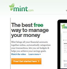
Mint.com states what they offer and the benefits right above their call to action.
These are benefits that resonate with the visitors needs.
It almost defies you not to download the software if you are looking for financial software - and they add a 'Free' incentive as well.
You may have to offer an incentive for people to give you their contact details, such as a free download or free trial.
2. Use action oriented language
- Call
- Buy
- Register
- Subscribe
- Download
All of these are words that are specific actions. It's easy to for the visitor to know what they have to do next.
To create a sense of urgency, add words such as:
- Now
- Today
- Limited Time
- Available until 30 Feb
Don't use obscure language if you can avoid it like 'Go' or 'Interested?' or the dreaded 'Click Here'.
3. Remove distractions

Don't give the user too many choices or they will become overwhelmed.
Limit the number of interactions or choices your visitors have to make.
Put enough white space around it so the CTA doesn't get lost competing with other content on the page, particularly anything else that is eye catching like images.
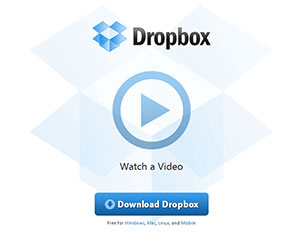
Dropbox do this quite well – there is pretty much nothing else on the page.
4. Make sure they see it
Position the CTA correctly – ideally high on the page above 'the fold'.
Some will tell you it's best in the centre, others will tell you to put it at the top left of the page which is the area that gets the most eyeball time.
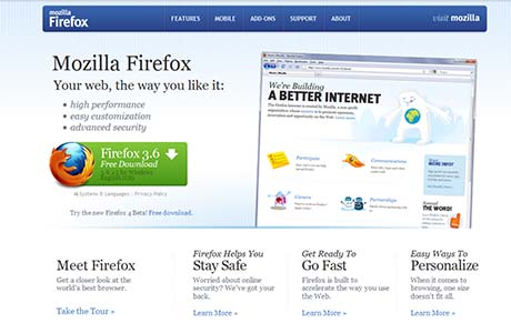
Mozilla and Mint put their call to action right at the top and to the left. For these sites the call to action relates to the primary purpose for the whole site so it works.

Use a colour that contrasts with the main colours on the site.
Make sure the call to action is big enough and use quality images and buttons rather that cheap clip art - there are plenty of free buttons available for download if you look for them.
You can put some kind of call to action on every page. But try not to overwhelm useful content. You could use smaller versions of your main CTA that's on your homepage.
5. Reward them for responding
If a visitor does click on a button in your call to action, don't punish them by asking for personal information that has no relevance to their use of the product, or taking them through a convoluted sign up process.
If you've offered them something for free make sure they get what they are expecting, not something with conditions.
Of course a Buy Now button on ECommerce sites is a call to action, so easy check out processes are a must.
6. Test Test Test
Ultimately any advice is going to be from either a 'what is best practise' or 'what we know works for us' perspective.
This will get you a long way, but your business and your target audience create a special situation that means visitors will respond better to some words, images and designs better than others.
While you could argue in theory that red or orange is a better button colour than blue - the only way you will know for sure is to try both and conduct tests to see what one gets better results.


