
Almost all websites have some kind of imagery on it. Otherwise they look a little, well....boring. And photo images (as opposed to illustrative design elements) are a great way to add impact.
But there is a right way and a wrong way. And sadly the wrong way is all too common.
Top 5 Most Common mistakes
1. Poor Quality
No, that 2 inch by 4 inch masterpiece you took with your iPhone then stretched to fit a space ISN'T good enough.
Even if you purchased an image, don't buy the smallest one you possibly can, then try and stretch it to fit the space - it will look terrible.
Blurry, out of focus, badly composed images make a website look cheap, poorly considered and badly put together. And in turn reflect very badly on your business by saying ‘hey, we offer poor quality, badly implemented services’.
Do you really want to say that about your company?
And don’t use clip art. Just. Don’t.
2. Using stolen images
It’s on the internet – so it’s free to use, right? Wrong!
It’s kind of scary how often we are asked to use images that we know someone doesn't have the rights to use. Just because you can find an image on Google it doesn't mean you can use it freely, especially for commercial use. Don't be a cheapskate; it could actually end up costing you a lot more in the long run if the owner of the image sues you for copyright theft.
3. No images at all
Let's face it, text – even if it is the best piece of copy ever written, is boring to look at and the web is a visual medium (for most people).
I've read articles by people who say you should NEVER use stock images, but I don't agree. Sometimes you simply don't have the budget to employ a really good photographer to take the kind of images you need. In this case, stock images are better than nothing or poor quality ones.
4. Images used purely for decoration
Having a page on your site about financial services and displaying a picture of an open field or some other unrelated visual confuses your viewer.
Subconsciously (or consciously) they will be looking at the image and their thought processes won’t be about your services, but where that picture is or other similar, unrelated thoughts.
Try and include images that illustrate your service or product, the people in your business or convey a message.
5. Stock images of people

Images of people are particularly problematic, especially if you chose to use stock imagery. iStock and Getty Images have some great images, but their business oriented people photos have a tendency to look a bit staged and very 'corporate America'.
Those whiter than white smiles and model good looks don’t feel authentic so can detract, as much as add, from your content.
See tip #4 about using stock images.
10 Tips for getting it right.
These tips are mostly about NOT doing any of the above, but just for emphasis – here goes:
1. Use a professional photographer
This is especially true if you want people in your images. Getting a photographer to take some pictures of your staff means your site will be more authentic. It is especially true for small business that people do business with people - so knowing who you are creates a friendlier, personal vibe.
And these images can also be used on Linked-in profiles and other material.
A very talented Auckland based photographer we know – Rory from Firefly Photography in Auckland explains what a professional offers that even a talented amateur can’t:
"In my mind, the key difference between an amateur and a professional photographer is simply that the professional understands every element that needs to come together to create an image tailored to each individual client.
A striking portrait is not a matter of aiming an expensive camera at your subject. Those of us who take the art of photography seriously understand that many things need to be done meticulously and well – rapport, lighting, posing, wardrobe, make-up, mood – these are just a few of the considerations that I bear in mind with each client I photograph.
A great portrait captures the character of the person being photographed. I truly believe that this is impossible to achieve without taking the time to meet and understand your client’s needs well before you ever put them in front of a camera.
Everybody can look good in a photograph.
That is the true hallmark of a professional photographer – the experience and ability to get the shot and create something amazing no matter who the client may be."
A professional can also help your products look AMAZING. If composed properly, they really sell by showing people how your product can be used, so they can imagine it in their hand, home or business.
Think about it – how often have you bought a product based on a tiny, grainy image because you’re confident it must be great in real life?
No, didn't think so.
2. Use real people and places
Following from above, if you are going to use photo's of people on your website, use images of real people as much as possible.
Include images of your staff at work and your premises, your reception desk etc. If people are going to be dealing with you, they are going to see what you and your offices really look like anyway so don't put them on the back foot by setting incorrect expectations.
If your staff get a bit skittish about having their photo taken, a group shot can sometimes be a decent compromise but a good professional will know how to relax people.
3. Keep the style consistent
Keeping the style consistent creates an impression of quality and consistency in your business as well.
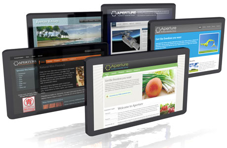 For example the image (above) has 3D images, and has no background so it sort of floats on the page. The one in the previous paragraph has a solid background.
Not only does the style of images have to fit with your service or product, and be consistent with the design of your site, it also has to be consistent with your brand attributes.
So if some of your images have a background, make sure they all do.
Don’t suddenly use a 3D image (like the one above), then an illustration or an image without a background. Decide on a style that fits the overall design and stick with it.
And if your design has a particular visual feel, match the style of the images with this overall feel. If it uses de-saturated images in the background or header for example, don't include images in your content that are super saturated or contain bright primal colours.
4. If you can't hire a professional photographer – you still need quality photos

If budget is a concern, there are thousands of images out there that are not that expensive to buy.
Stock images, if chosen carefully and incorporated into the design can work just fine.
Spend some time finding good images, and be careful of ones that are very popular as you may find them being used by other organisations as well and that can be downright odd!
If you must use stock images of people - try and pick ones that at least look like they represent you and your brand and your audience. Don’t just buy generic happy people sitting at a desk.
And if you do use stock images you can trim, adjust or add to them in such as way that they look a little bit different to the original. Add effects like colour overlays, blurring segments or text call outs.
Because we look at stock image sources all the time, you might be surprised at how many of the bigger companies use stock images. But they use quality images that work in the context of the content and have frequently been enhanced or modified in some way.
And if you do know someone handy with a camera or insist on doing it yourself, the quality requirement still applies - high resolution, well saturated and composed images are still a requirement. NO one-off hurried 'shaps'.
5. Buy BIG
The bigger the resolution, the more uses you will be able to have for that image. You can’t scale them up – which means if you need an image for a spot 1200 pixels wide you can't buy a 600 pixel wide image and just make it bigger to fit. (See point 1 about poor quality images).
Images usually need some kind of editing to fit the space and purpose on a website and the bigger the resolution the more freedom you have to work it into the design effectively.
If you do include product photo's, it’s common to use thumbnails to show multiple products on a page, but give people an option to view a big size so they can see the detail.
There is a design trend at the moment to use big background images or images that take up the whole space ‘above the fold’ so bigger is necessary for these types of sites.
6. Resize to fit
Having just said to buy big, that doesn't mean you should squeeze a 3000 x 4000 pixel image into a space that is 500 x 600 square 'hole'. The browser will load the image at snails pace.
Apart from annoying your visitor, especially one on a mobile device who's data your sucking up, speed is a factor in Google's search ranking calculation.
7. Check the rights
Always check to see what an image's usage terms are - even if available at no cost. Some authors give away their images for noncommercial websites while charging fees for commercial use. In some cases you can use an image without having to pay anything, as long as you include an attribution.
Copyright is an automatic right, so assume an image is copyright unless you find out you can use it legally and how.
Here is some information about copyright in NZ
8. Include alt text
Alt text and titles provide screen readers and the search engine robots with information about the image. They also allow browsers to display a description of the image as a tooltip. So make sure they are relevant and descriptive, for example ‘external cladding showing rot’ is better than ‘image123455’.
There is also a small SEO benefit in doing so, and will help in cases where people are doing image searches. If you sell products, descriptive file names and alt text helps your product images (and therefore your site) to be discovered.
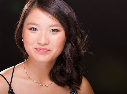
9. Create sight lines
You can use your images to get people to read your content.
If a person in an image is looking in a particular direction the reader will tend to look in the same direction.
In the image below, the direction of the model's eyes compel you to look at what she is looking at, so you could place calls to action or links in that spot.

Sight lines can also be created by natural straight lines (like roads) or other aspects of an image (like natural rock formations, lines of trees etc.).
10. Make the images work for you
One of the most important tips has been left till last. Images that are purely decorative tend to be ignored.
A single image can convey a lot of information in just a few seconds so use them to:
- Illustrate a point in your text
- Help people understand something
- Show how something works or is done
- Show what your product looks like
- Convey a message or feeling that compels us to respond in some way
We’ll let Rory have the last word:
"Your clients WILL make assumptions about your professionalism based on the imagery you use.
Investing in professional imagery ensures that you make the perfect first impression when you aren’t present to do so yourself."

